http://www.zazzle.com/naris35
Tuesday, December 8, 2009
so after i made the acorn grenade i went straight to building i didn't do much concept work on this one due to lack of time between this project and like three others but it seemed to just come together on it's own. I even went to zazzle.com and put the acorn grenade on a bunch of stuff. you can see it at my zazzle store
Slf website

So our last project was a flash website but it was with actionscript 3.0 which is all new to me so instead of doing way trippy stuff i decided to just to basic code and work on my design aspect of websites. My idea was to make a website of the Slf (Squirrel Liberation Front) it isn't real but it would be cool if it was, like revolutionary squirrels it would be a hecktic war for sure. Any who so to make my site way nice design type thing i decided to make the logo first and base it off of that so i posted the logo here for starters.
animation project
So this is stuff for an animation project in my GID class we had to make typography animation from a sound clip and it was way fun especially cause i have never done typography anything. so first he had us do a poster but mine sucked so bad i'm not going to post it but for this project i really just got into flash and let it fly. I pretty much animated what ever came to mind.it is a clip from high strung just look it up on you tube if you want to here more of it.

 I also need some content for the other pages like the adventure page where you get to learn about how to explore the land in Battle for Koht. So again i just went to mouse and paint brush tool. I drew them way huge and then shrunk it down to get thinner looking lines though they are way shrunk down on this post.
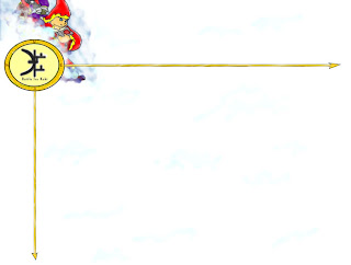 Well so like i said i decided to ditch that other page design and decided to do something more like this. I wanted to make it look like the who sight was in a dreamy state mainly cause the game it's self is in development and is in a dreamy state in a way. so i made this background and i used the compass for the navigation of the site.
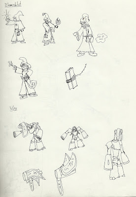 Here are the elementalists and the Vox. the elementalists will fight with the elements around them for example ice in an ice cave fire in a volcano you get the point. they can also fight with their books like nun'chuks. the Vox are an alien race that has evolved to control stuff like sound electric and psychic waves they use to mess with their enemies and help their allies.
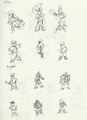 Well here are the shifters and engineers. we went with the first shifter shown here whe one with a little wolf friend. the others might end up as alternate costumes or characters though nothing goes to waste right. As for the engineers we went for a mix of all of them. but his armor will be pretty changeable so the more the merrier with his concept design.
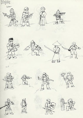 Well we needed some character design for each character so we could make a page for them of course. so here are some ideas about the gladiator and marine they were super sketchy spent no more than 1 min on each so that is why they look super cartoony. We actually went with a different model for the gladiator than shown here and actually we went with a different marine as well but these sketches help form them.
 These are some logo designs for the game. What the hope is that eventually the logo will take over the name of the game kind of like mac and the apple with a bite out of it. the one we are using right now is the one that has a c on one side and little staff like sticks on the other. but through out the development process it will most likely change.

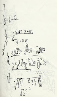 Well these are for a website I did for my GID class. While they are not fun to look at the organization process is one of the most important parts of an over all well done site, at least when I make a site it is important, maybe there are super web-masters that can do with out but that is only in legend.
on the very left we got the average page layout i actually ditched that idea and went with another cause this idea was to cluttered.
The picture jsut to the right is a site map so i can have an idea for the content of the pages. The site is for a game being made called "Uhis: Battle for Koht". I'm going to be posting more stuff about it in a bit so no worries.
Monday, August 24, 2009
Start of a blog
So this is the start of a blog i am hopping to a lot more in the future. I'm and art student and want to make a way to show my portfolio to anyone who wants to take a peak. check back later for when i upload some old work and sneak peaks of future work!
Subscribe to:
Comments (Atom)


